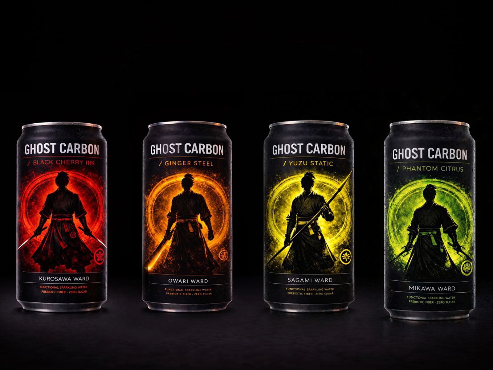
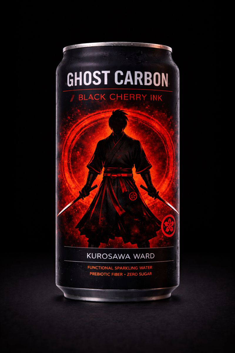
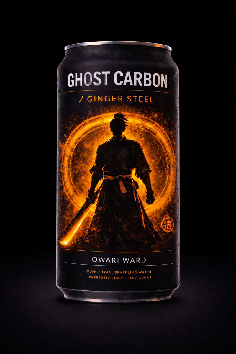
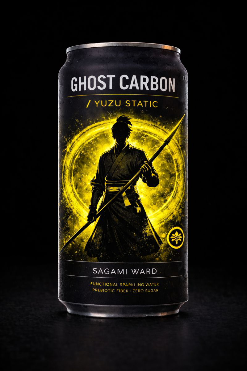
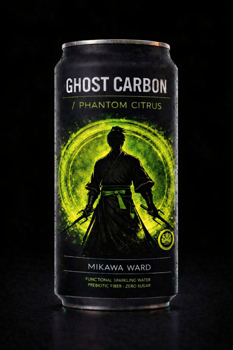
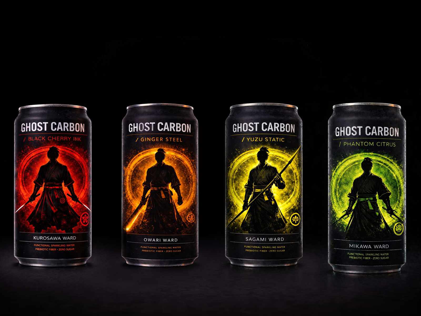
Built as a scalable energy drink lineup with a strong central system.
Ghost Carbon pulls from anime and samurai aesthetics, but the focus was structure first. Not decoration. A layout that could hold together as new flavours drop and the range expands.
One clear hierarchy across all cans.
Consistent emblem placement.
Strong vertical read from distance.
Consistent emblem placement.
Strong vertical read from distance.
Each flavour shifts colour, character and symbol while staying inside the same visual framework. So the lineup feels unified on shelf. Not like random one-offs.
The goal wasn’t one hero can.
It was can number ten still looking like it belongs beside can number one.
It was can number ten still looking like it belongs beside can number one.
Focus areas:
– Energy drink can layout and hierarchy
– Variant system across multiple flavours
– Anime and samurai inspired visual language
– Shelf presence and lineup cohesion
– Built as a scalable brand system
– Energy drink can layout and hierarchy
– Variant system across multiple flavours
– Anime and samurai inspired visual language
– Shelf presence and lineup cohesion
– Built as a scalable brand system